Beaver Builder AB Split Test Case Study
Here at Beaver Team, we thought, what better way of showing off our new AB Split test plugin, than by running a test.
That’s right – if you’ve been on our site in the last month, you’ve been tested. I bet you didn’t even notice 😉
The Idea
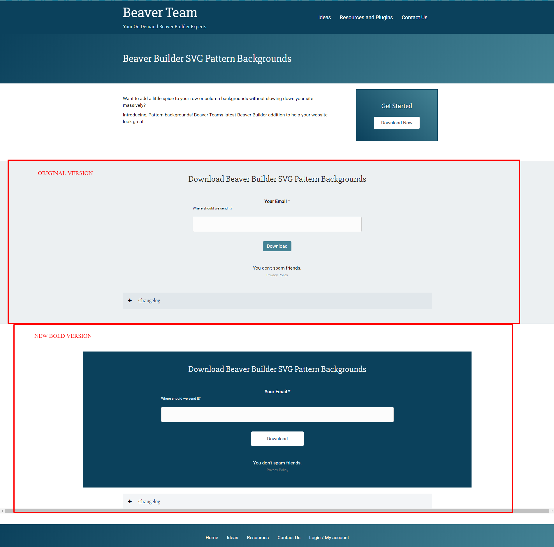
We decided to test that if we make the resource download area bolder, will we get more people to enter their email and download the free plugins? Surely, the bolder the area, the more downloads we will get, right?
The Test
In the image below you can see the resource page, with two alternate download areas. Visitors were randomly picked by the plugin to receive a variation, and never saw the other variation.

As you can see, we’ve set up two versions, that both will end up on our “Download Thank You” page (which is where we placed the conversion module, to log the conversions)
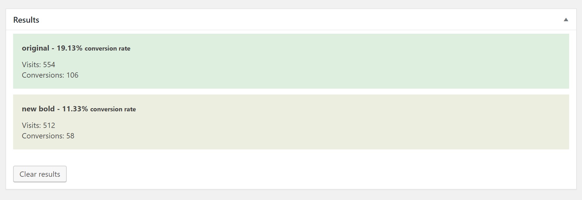
We segmented some of our traffic, using our new soon to be released segmentation tool and the resulting traffic and stats are below.
The Results

As you can see, the ‘new bold’ variation has been performing at a much lower rate.
Interpreting the results
It looks like users that have received the ‘new bold’ version have not been compelled to enter their email to download a plugin. This may have been because the new bold variation looked like an ad, or just because it didn’t have the correct flow for users to be compelled to enter their email. Either way, it didn’t work better than the original.
Next Steps
We’ll make some tweaks to the new bold variation, and reset the test – then check on the results in a month. By the time you read this post, the new bold version you see above will be different.
Want to make easy A/B tests on your Beaver Builder site? Check out our new Beaver Builder A/B Split tests plugin.
COMMENTS:
Level up your Beaver Builder skills
Over 2,000 Beaver Builders can't be wrong!
We've got a million ideas that we've implemented on over 100+ BB enabled websites.
Pop in your email below, and we'll let you know when a new post or plugin is available 🙂
Newsletter
"*" indicates required fields
Spam sucks.